Site review: Chicago Tribune
Newspapers are dying. People are now less likely to buy physical paper than ever. Enter the world of the dying, revenue grabbing news.
UX
I, like others before me, have clicked on a link. I've done so because the story was linked from a friend's Twitter feed, but without reference. Let's have a look at what we're greeted with.
 With AdBlock disabled we receive a page weighing 16.8MB, well beyond what I consider to be professional. It's a bit like opening your door to a friend you've invited to dinner, and they turn up with 50 friends who all expect to be fed. Anything beyond about 3MB without my approval is abhorrent.
The page takes 10.54 seconds to complete on my 300Mbit connection, many times over the acceptable limit of three seconds. The DOMContentLoaded completes in 190ms, which is actually fine, but the Load is 5.89s – this is the time it takes for the page's main assets to correctly structure themselves on the page, before which everything will be jumping around and unfixed. This is far, far too long.
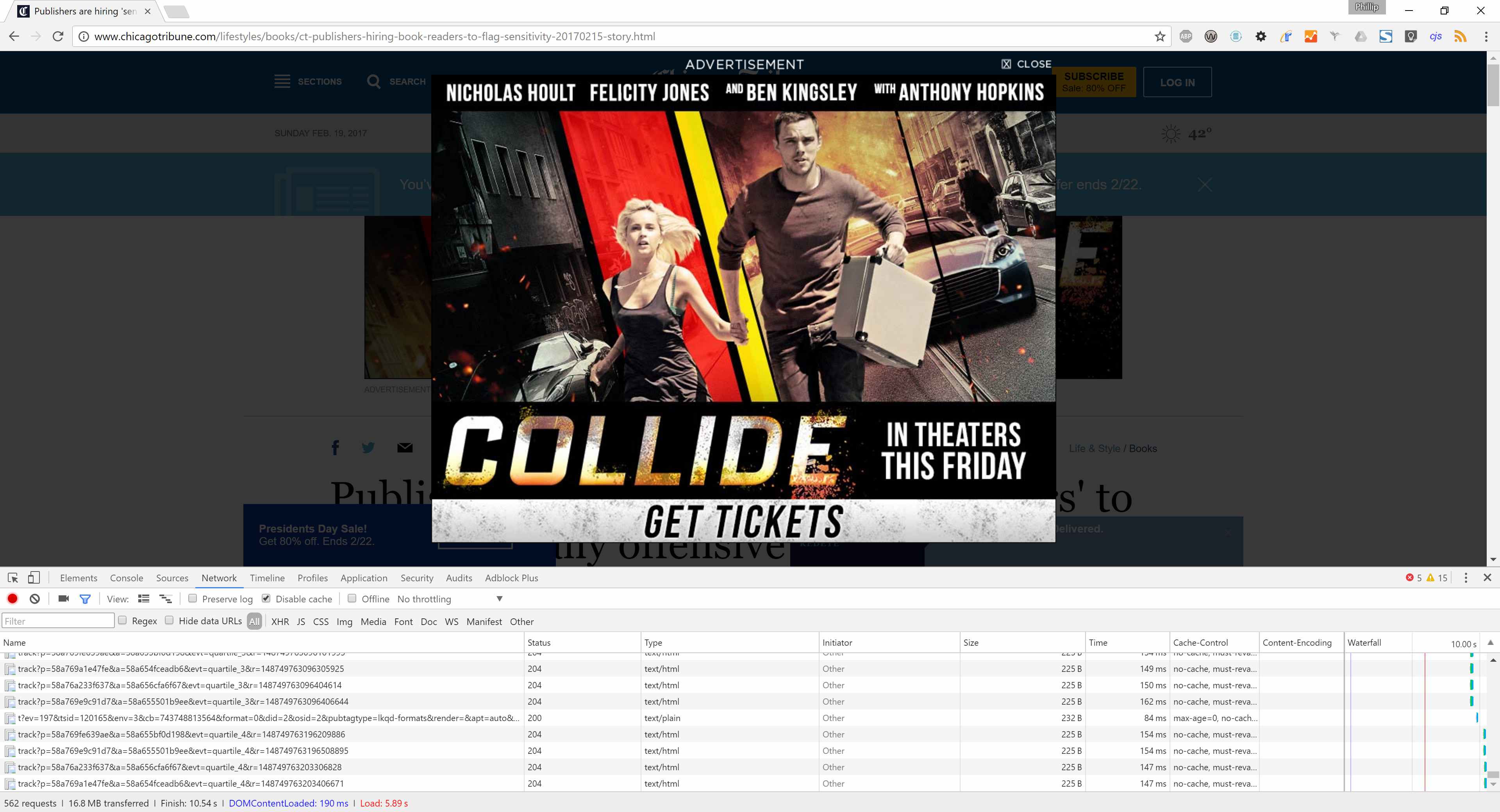
Now we're instantly greeted with a deadly sin; a modal third-party advertisement before I've even done anything, which itself is overlaid across three other adverts. One of those adverts is then overlaid over one more advert. Remember the days of popups and the popup blockers that had to be created because of the state of the web? We're back to those days, folks.
Once you've battled past the adverts, the page has minimal content; I'd say it's roughly 1/7th news article and 6/7ths adverts. The site loads more content as you scroll, but I'll just scroll to the end of this one article. The article consists of 1200 words and two images; by the bottom of the article I've seen 19 adverts, one of which is an auto-playing video without sound. The page has now ballooned to over 2,400 requests and 47MB. This figure is absolutely outrageous; if I were viewing this on my current mobile data plan it would have cost 47p – more than the cost of an entire typical UK newspaper.
With AdBlock enabled the page has 156 requests and loads 1.2MB by the end of the article – a much more respectable figure. This is why AdBlock exists, and it's why pleas from genuine advertisers will fall flat. We're sick to death of everything you can see on the page here.
Development
Code style isn't great. There's a huge amount of JavaScript dumped into the page in multiple sections; this should have all been placed into a separate file. There are also multiple code blocks encapsulated in HTML comments – these should not have been served to my browser.
The page fails W3C validation, and thus is not HTML. 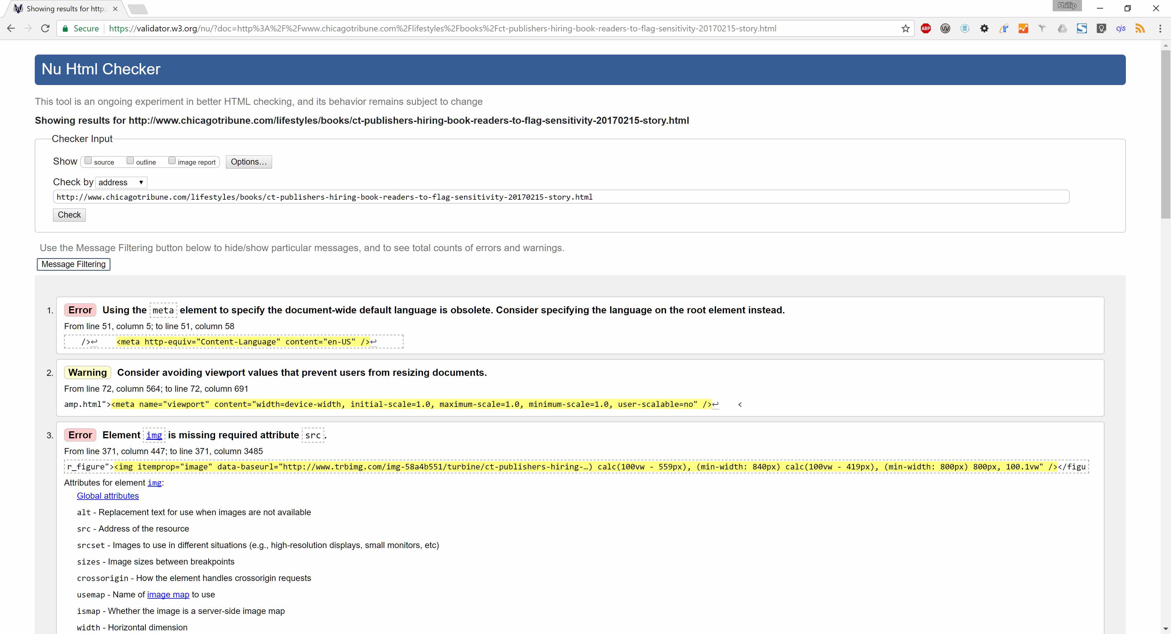 Only 13 errors though, far from the worst I've seen. Running the page through the visual accessibility tool shows why we may only have 13 HTML errors – we're receiving a redirect from the article to an article not found page instead, clearly a broken design which will not be good for SEO. Onto the manual accessibility testing instead.
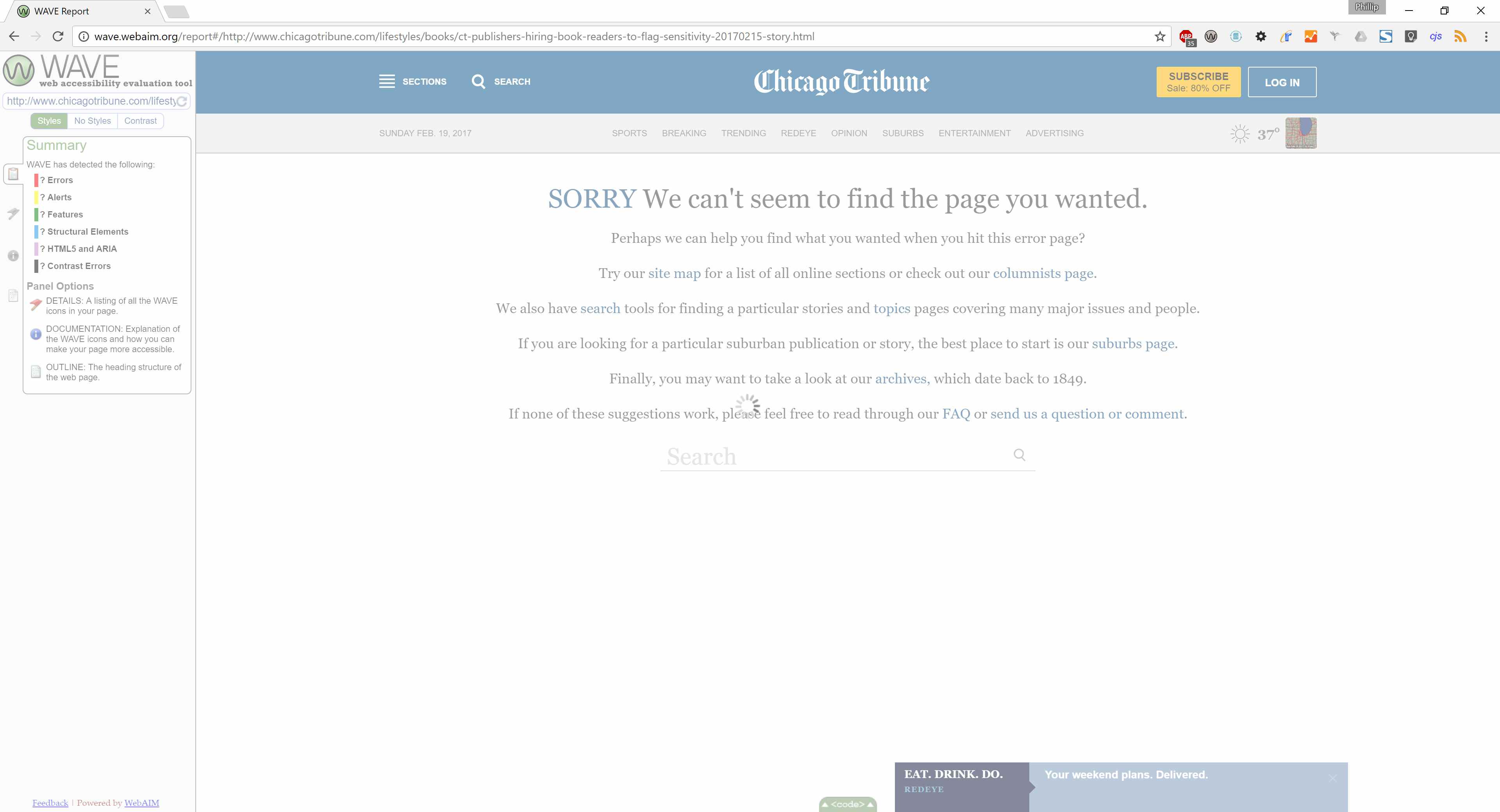
Tabbing through the page first highlights every single advert. I can never tab to the heading navigation; instant accessibility fail here. Many of the colours are also not contrasting enough. And to top it off, like most newspapers and fashionable blogs these days, the typeface is serif – decreasing readability for sufferers of dyslexia.
You can probably guess what we're going to get from GTmetrix, but I'll tell you anyway: F F, with above average loaded time, page size, and requests. A full house of woe! Worst offending parts were the huge number of redirected assets, no caching for most of the page assets, lack of keep-alive, no protocol consistency on assets, minimal gzip compression, lack of expires headers, too many HTTP requests, etc. This just shows how any site will be dragged to the gutter as soon as you add too many adverts to it. 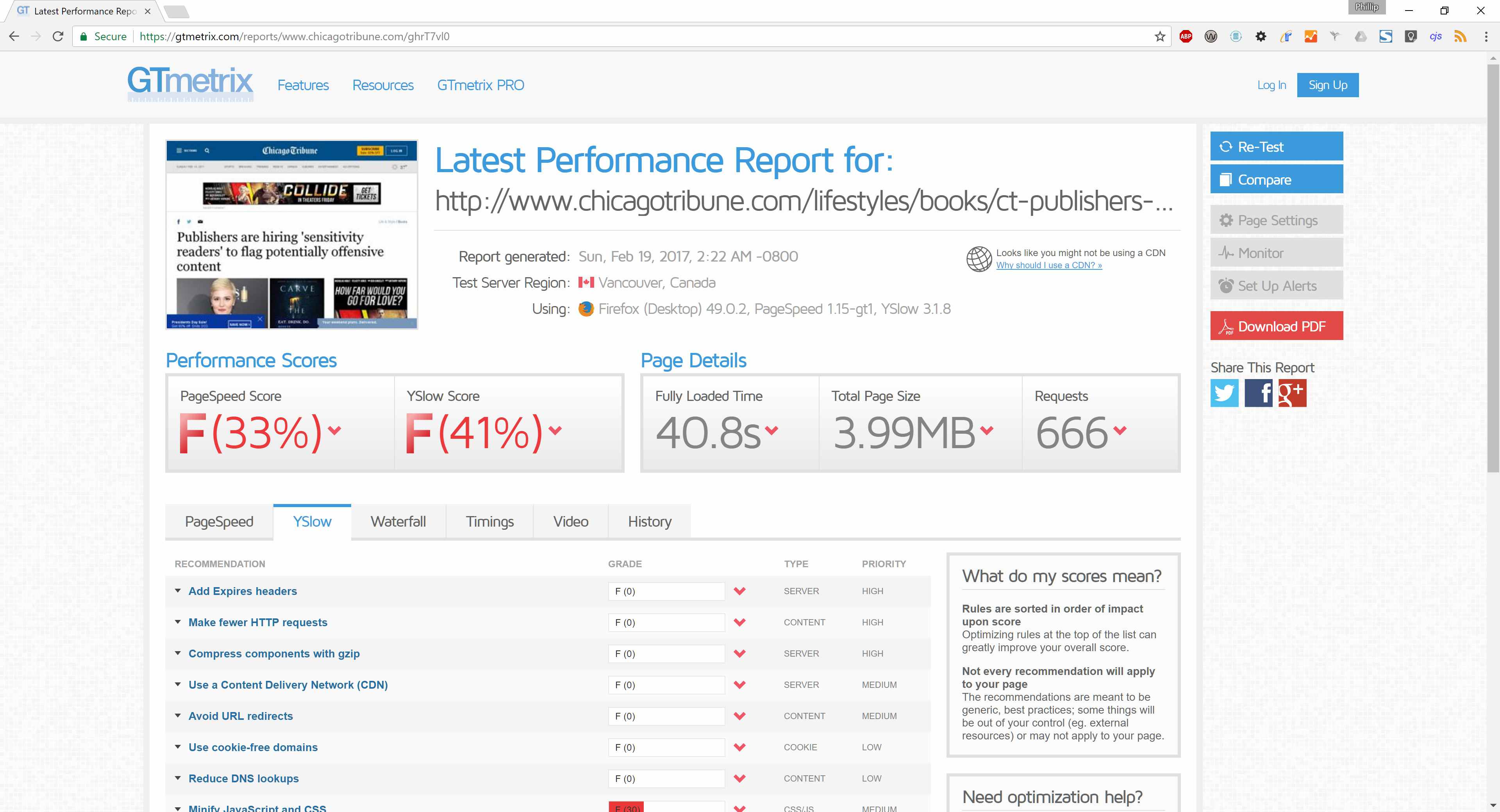
Branding and mystery meat
The site has invented its own hamburger with four horizontal lines, but it's labelled it ‘sections' which is better than a normal hamburger. Except on mobile where the label disappears, and it becomes a non-standard hamburger. The Facebook logo is non-standard and against their brand guidelines.
Conclusion
The page suffers from a poor UX, is too heavy, slow, doesn't validate, isn't accessible, get's the worst possible score on GTmetrix, and thus is the worst site I've ever reviewed. It may be the first I've reviewed for this blog, but I don't see its position changing any time soon.